Pratt Institute Libraries Content Strategy

The Pratt Institute Libraries website was out of date and failed to support
their mission.
As Content Strategist, my role was to propose an architecture and content design to make information easier to find and more engaging.
The Pratt Institute Libraries website had not been updated when Pratt Institute redesigned its website according to new “identity guidelines.” Thus the library administration gave our group of graduate students in the Pratt Institute Information Experience Design program the opportunity to propose a redesign. In initial interviews, our stakeholders from The Libraries described the need for a clearer navigation to enhance usability of the site for students, faculty, and staff. They also want to support their mission to make their collections and services easier to access and use, and to teach users best practices in the research process.
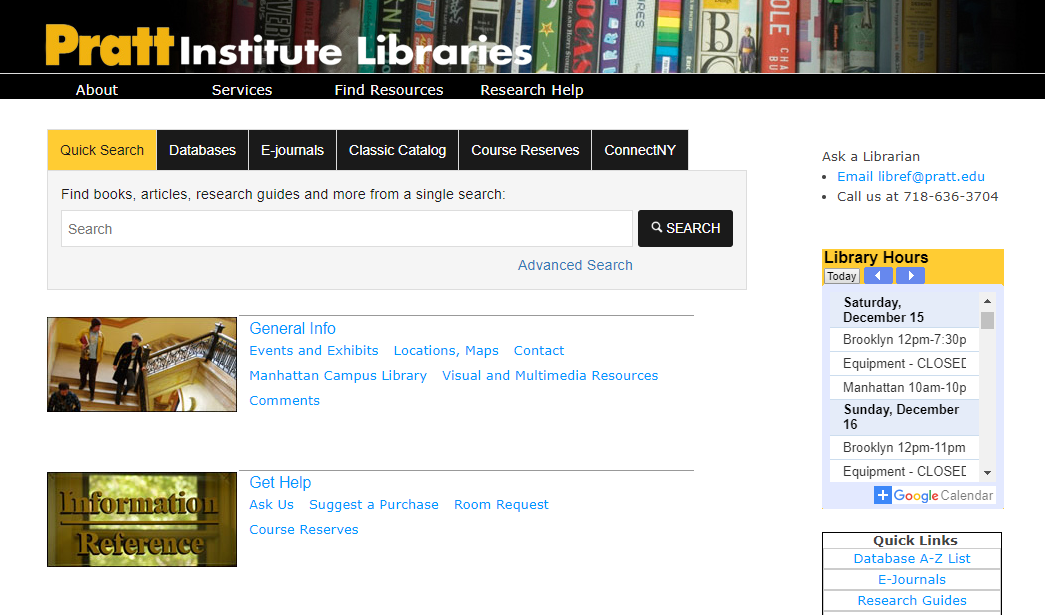
The current site has limited top-level navigation options with unhelpful tab labels, while every page also contains multiple hotlink navigations as well. The multiple navigation options combined with insufficient explanatory content make it difficult for users to find their way in the site.
Our design team realized that The Libraries support their users in an entire system with many touchpoints and interactions — not only on the website, but in the physical spaces and with the staff as well. In turn, the “content” of The Libraries exists at all of these touchpoints. Therefore my design thinking — while focused primarily on the site — also had to take into account providing content stability and consistency for the entire system.
Our user research confirmed the need for a new architecture and better alignment of voice, tone and brand.
While the research team performed surveys and observations to determine our user groups and their priorities, I created a CONTENT AUDIT spreadsheet. My team members Sara Ribaudo, Kai Chang, Jamie Raymond and I each contributed detailed information for a section or two of the current site.
The content audit contains comprehensive details about the navigation levels, content descriptions, and recommendations about revision planning.
The audit confirmed the stakeholders’ opinion that while there is a wealth of valuable information on the site, it currently features outdated navigation options and an extensive duplication of content that is presented in a non-intuitive organization, with little formatting or visual interest.
In addition, our BRAND VOICE AND TONE ANALYSIS compared the current content against The Libraries’ mission statement and their stakeholder goals. This showed that most of the content is written in an informative but unengaging voice and tone. It is written in the appropriate 10th-11th grade reading level that is right for web readers, but it appears in lengthy blocks of uninterrupted text. All in all, the content cried out for revision.
““The mission of the Pratt Institute Libraries is to provide outstanding service and access to a resource-rich environment that facilitates critical thinking and creative teaching and learning in the Pratt community.””
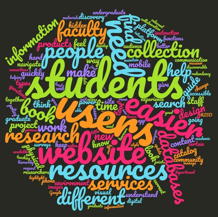
I created this word cloud from transcriptions of stakeholder interviews.
I was concerned about recommending such extensive content revision to our client because we had been given little information about the extent of his resources for this work. I discussed workflow expectations with him, and was relieved to hear that he had already begun to plan for rewrites. We were on the same page about the needs for his content: phew!
Our 5 user personas were based on their expertise and usage of The Libraries.
The content strategy and design teams contributed to the creation of five USER PERSONAS for The Libraries; the key qualification was their level of experience with the website and the physical space.
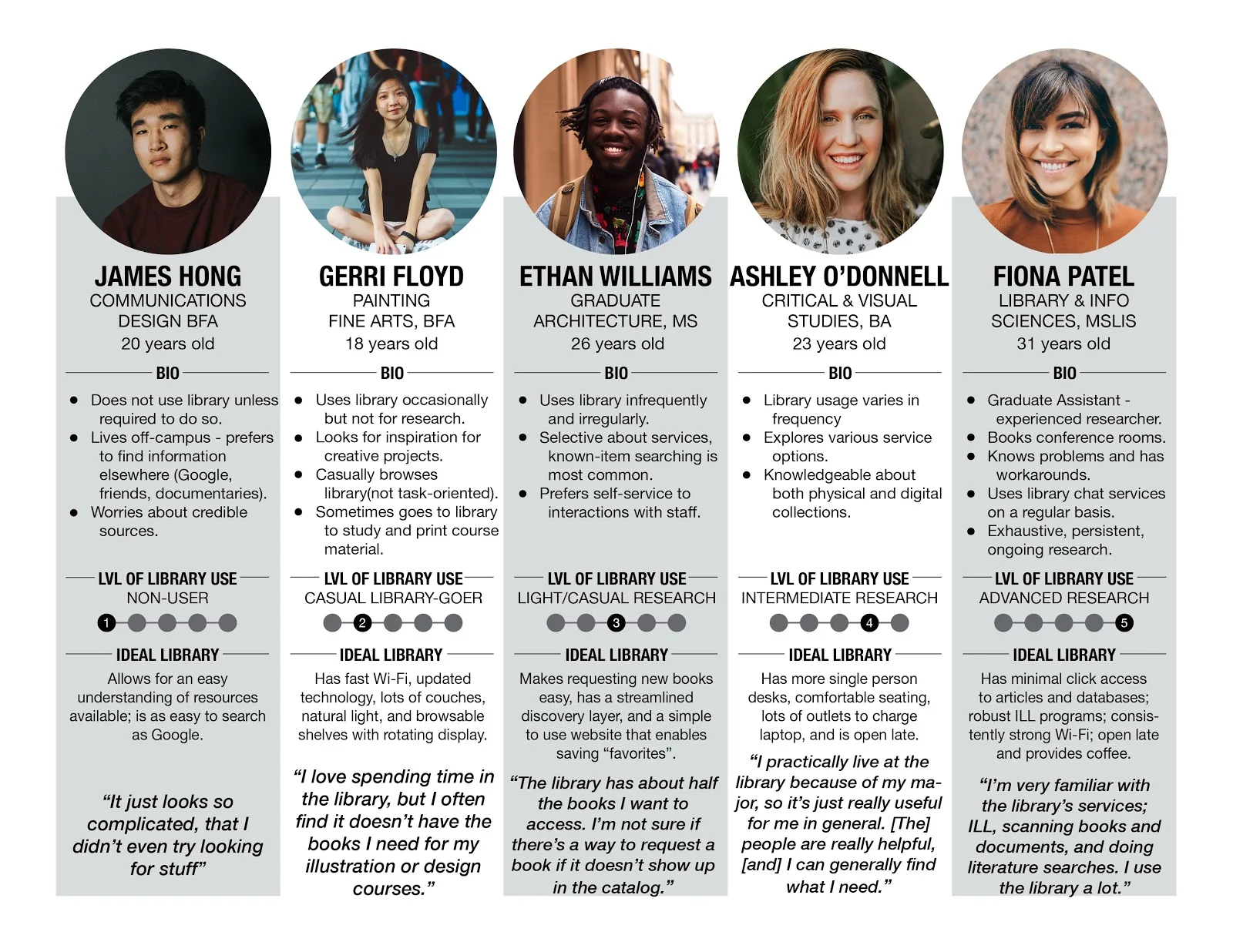
These five user personas (non-user, casual library-goer, light/casual researcher, intermediate researcher and advanced researcher) were derived from more than 100 survey participants, all of whom were users of The Pratt Institute Libraries.
We built five Information Architectures, and blended them into one.
Meanwhile, my content strategy team derived a list of about 50 topics, which came from the current site and our competitive research. We tested these with 40 participants in a CARD SORT. Analysis of those results allowed us to derive our first draft of the INFORMATION ARCHITECTURE (the IA). First we created individual IAs for each of the five personas (to insure that we were considering the primary needs of each group); then we collapsed those five into a single IA that would serve the combined needs of all users.
We built five IAs based on our five personas in Realtimeboard, and then Kai Chang and I derived a single combined first draft, which we then tree-tested.
The design and content teams concepted a set of user tasks to represent the needs of each persona, based on what we had learned in the survey about users’ priorities. We TREE-TESTED those tasks in our draft IA with 47 participants using OptimalWorkshop, and Sara Ribaudo created a spreadsheet customizing the data. Her tool helped us to realize that users still had trouble understanding the basics: they needed very clear directions about how to view and borrow materials and use all of the available services. Thus when we revised the IA for our final proposal, we added a navigation tab for “How to use The Libraries.”
Our proposal IA was designed with the Pratt color palette and The Libraries logo by content strategy teammate Sara Ribaudo.
This IA placed a priority on giving “Research Help” as well. It also created a space for the more specialized needs of Faculty and Staff.
The design teams used our IA to propose a more navigable and welcoming site for The Pratt Libraries.
The web design team applied our IA to a set of key task flows, based on the most important needs of our five user types. Our IA is easy to find and easy to navigation from this welcoming and informative home page.
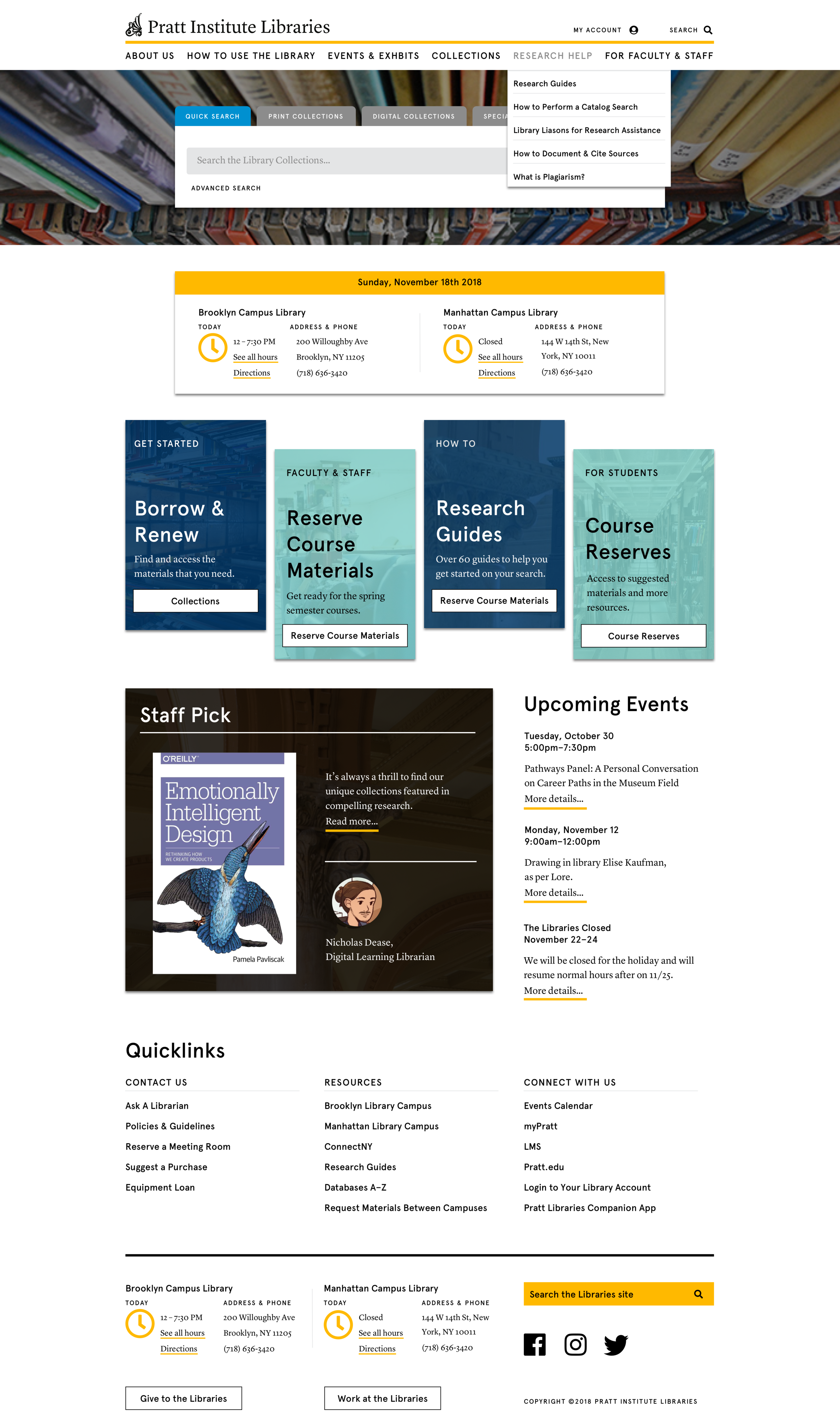
The website design team applied our information architecture to create a clear navigation for a more welcoming, engaging and teachable user experience of The Libraries website.
It was gratifying to see that some design team members began to think “content first” as they worked. Armando Garcia, leader of the web design team, read a “Content Strategy for UX Designers” text that I provided for the team, and we collaborated on crossover issues such as labelling and how that had an impact on navigation design. He encouraged the designers to use real content rather than ipsum lorem, which helped support the usability of their work. Designers came to consult with my teammates and me regularly about language, word choice and other content questions in their own work.
A content redesign for a complex system requires strategy and styling guidelines.
In order to produce consistent content across all channels — website, physical space, a library navigation app, and even in email communication and social media — our client needed a style guide, written for staff and content providers. We developed a CONTENT STRATEGY GUIDE that would be independent of, yet complementary to The Pratt Institute Identity Guidelines.
In the Guide I describe The Libraries’ goals through their mission statement and by including the succinct, authoritative Code of Ethics of the American Library Association. We also included tips for branding tone and voice, which Sara described using Nielsen Norman Group’s framework of “The Four Dimensions of Tone and Voice .”
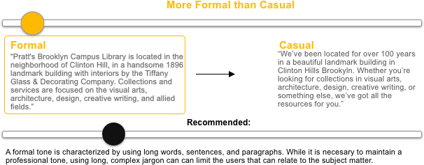
This sample of our tone and voice analysis demonstrates where we recommend The Libraries compose content on a scale between “Formal” and “Casual” — one of four such measures in the NNg framework.
The Guide also gives directions about “writing for the web” and how to format content to support the most engaging user experiences. In addition we provide styling and technical tips for making the content accessible, which we know is very important for librarians. Finally, I asked Alex Srp of the space design team to contribute styling for signage in the physical space to support her team’s wayfinding recommendations.
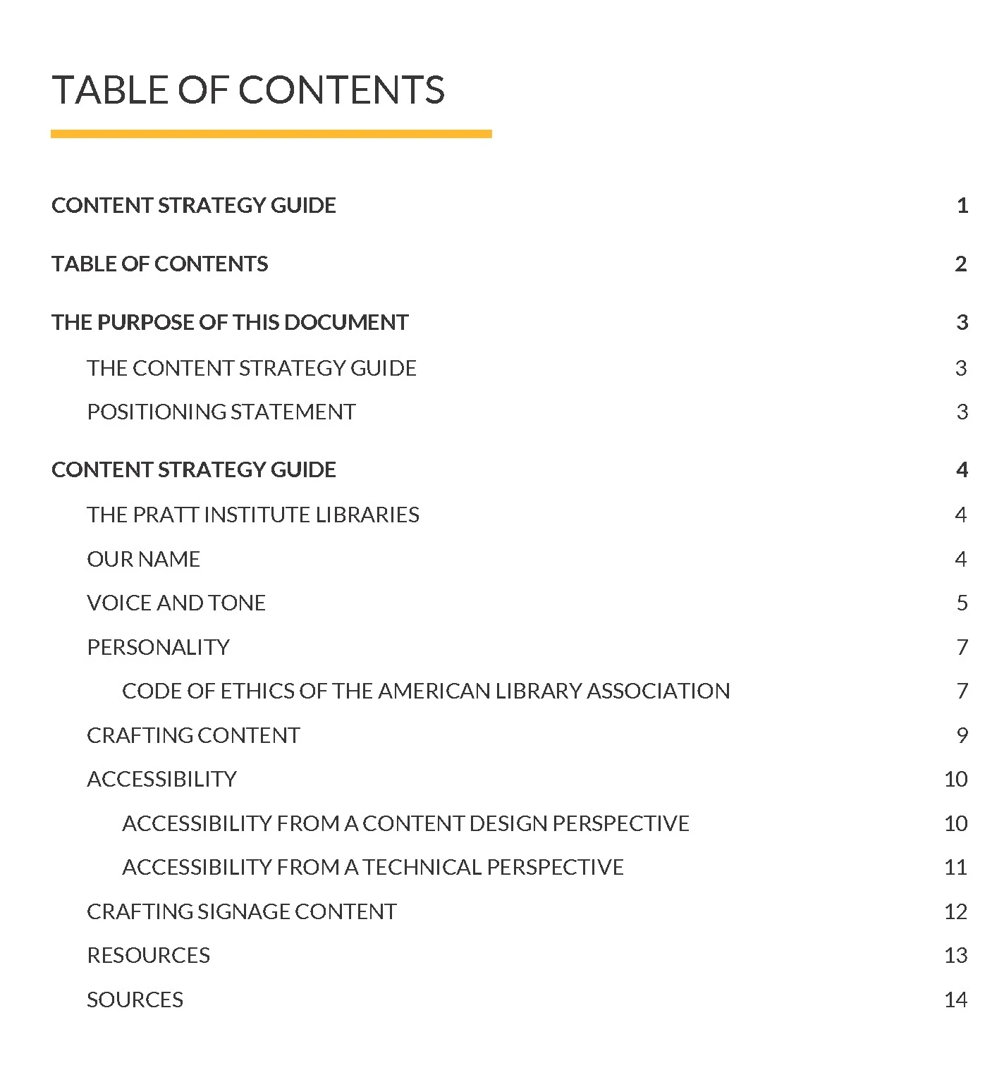
This Contents page for the Content Strategy Guide shows all of the features needed to support the styling of content in The Libraries and on the web, including key tips and guidelines for Accessibility.
I also wanted to support the massive content revision project indicated by our recommendations. To that end, I provided some freely-available resources about content workflow planning, content creation, and governance, together with the content audit which can be used as an inventory for the redesigned site.
Many of our content recommendations will be executed in the re-launch of The Libraries website.
Our client was enthusiastic about all of our deliverables. In particular — though with a few tweaks required by key stakeholders and their expertise — he will use my content strategy team’s information architecture in the redesign of the Pratt Institute Libraries website!