New York Academy of Medicine Site Redesign
Librarians at the New York Academy of Medicine needed a rescue.
Working under multiple constraints, our ux research and design team proposed navigational improvements to make key information discoverable on the New York Academy of Medicine website, and reduce high-volume phone queries to their overworked librarians.
The New York Academy of Medicine (NYAM) Library, which opened to the public in 1878, houses inspiring and educational materials for the medical and historical professions, including artworks and other rare materials dating back as far as the 16th century. With the advent of technology, historians and other researchers from all around the globe now have access to information about these collections, so it is vital for the NYAM Library website — every user’s first access point — to provide a satisfying user experience.
Five researchers from the Pratt Institute’s Graduate Information Experience Design program, in consultation with the Reference Services and Outreach Librarian and others at the Library, performed usability testing to isolate the key issues and pain points in the usability of the website.
Our options for redesigning the site were limited.
The NYAM site design and branding were fixed due to a recent redesign, and our client did not have the power to make significant changes. We were not able to make recommendations for global changes, therefore, and we were constrained to the content of the Library section of the site. However, we proposed a set of recommendations for improvements that could be effected within those fixed parameters.
Our client catered to users with a variety of experience levels and needs, and had four well-defined goals.
Our client, Allison Piazza, the NYAM Reference Services and Outreach Librarian, defined the key user groups for the NYAM Library website:
“Lay” researchers
Medical school students
Historians
Academy fellows
Undergraduate students
She gave us four goals to pursue in our user research:
Make it easy for users to locate the information they need on the NYAM Library's website;
Help researchers better understand the logistics of how to use the library: i.e. that visits are by appointment only;
Promote the Library Shop;
Discover whether users understand the role of The Center for History of Medicine and Public Health and how it is related to the library.
We conducted usability tests to discover user pain points.
Following the methodology of The Handbook of Usability Testing, by Jeffrey Rubin and Dana Chisnell, we mapped four user tasks to our goals:
Task 1: You read in yesterday’s newspaper about an event at the New York Academy of Medicine Library. You want to find out more about when the next event will occur and find all the necessary information in order to consider attending.
Task 2: You know that the Library has records from the Hospital Graduates’ Club, and you want to see if the Library has minutes from 1886. Locate this information on the website.
Task 3: You need to work with a particular book in the Library’s collection for your research: find where to access the title information on the NYAM website. How would you go about getting physical access to this item?
Task 4: Your friend has a notebook with a Vesalius skeleton on the cover, which you admire. She says she bought it online at the NYAM website, and you want to buy one for yourself. Where would you find it on the site?
After pilot-testing the tasks, we developed pre- and post-surveys, an orientation script, consent forms and incentives to guarantee consistency in our results. Finally, using Lookback software, we conducted our test with 10 users: 4 experienced users provided by Allison, and 6 first-time users, whom we recruited.
We used scripted materials for consistent, qualitative results.
We collected both quantitative and qualitative data in our research.


We listed all the problems we found and rated them to determine which problems were most important and required improvements. We also used qualitative data (quotes/anecdotes from participants) as evidence in summarizing our findings.
Our findings and recommendations uncovered and addressed issues with way-finding, labeling, and information architecture.
Experienced users failed at an average of 12% per task, and succeeded at an average of 28%. First-timer users failed at an average of 10%, and succeeded at an average of 50% per task. Even though they failed more often and succeeded less often, experienced users found the website “usable” and “inviting” and felt confident — while first-timers had more success performing our tasks, but reported higher frustration levels.
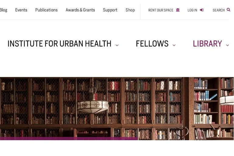
Recommendation: mend the mega menu.
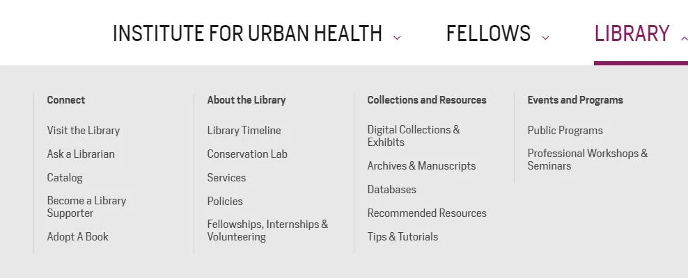
NYAM Library mega menu BEFORE our changes were made.
Our most important recommendation was to improve the information architecture of the site, to make the content more findable at the first glance. The key points:
add a new sub-menu called “Connect,” so users would receive earliest possible notice that they should “Schedule a Visit,” and add the “Shop” there;
change the “Center for the History of Medicine and Public Health” to “Events and Programs” (clarifying the distinction between events for the public and those for professionals), and move “Friends of the Rare Book Room” to that sub-menu.
Our proposed transformation looked like this:
““Your hard work was well received! We’re moving forward with the changes to the mega-menu.”
— Allison Piazza”
The NYAM Library megamenu TODAY. They opted for most of our changes!
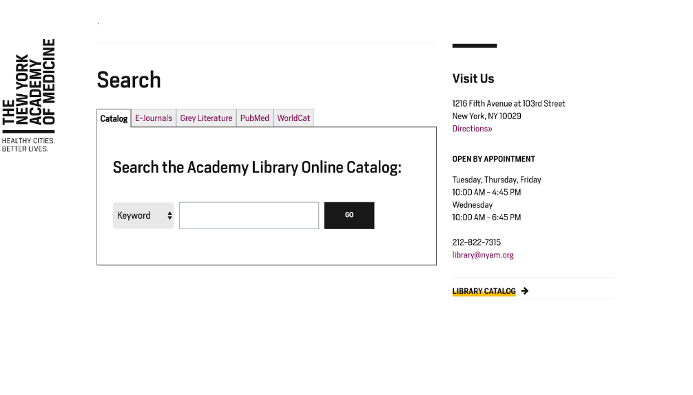
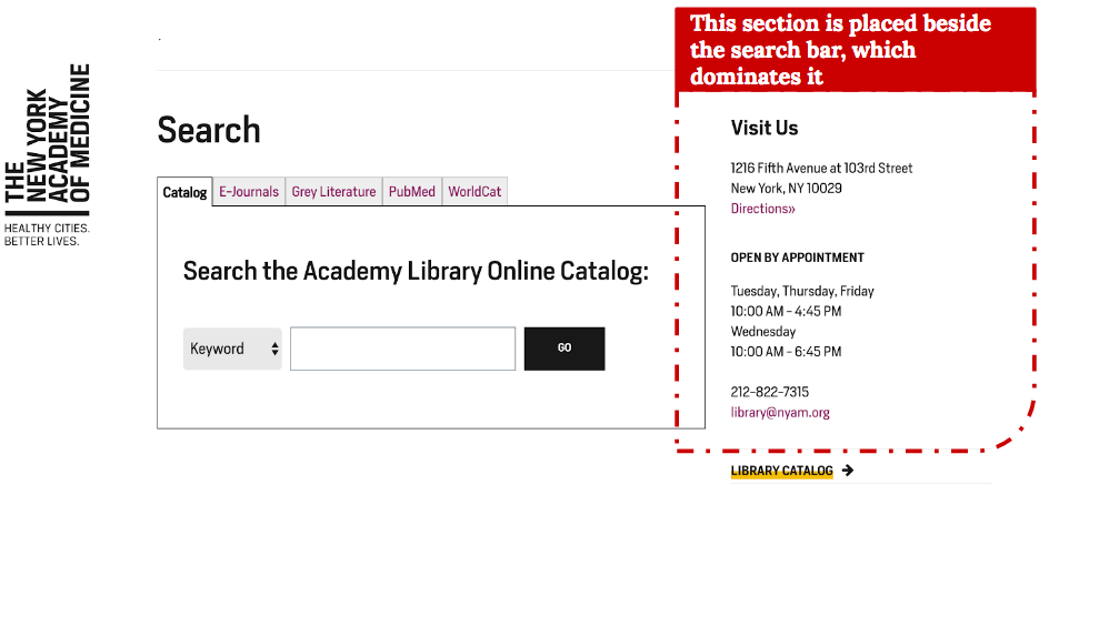
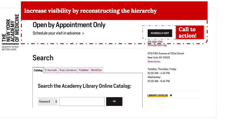
Recommendation: make it clear that visits must be scheduled in advance.
On the main page, “OPEN BY APPOINTMENT” in the right-hand navigation — even in all capital letters — was not discoverable by our users. The result for our client was to receive an unnecessary volume of phone calls from users asking for clarification on how to access materials in the library — and worse, the awkward situation that arose when researchers and scholars would appear at the library without the necessary pre-scheduled appointment.
The fault was due to the relatively small font size in the design specs, and because the label was overwhelmed by other content: the search bar is occupying a larger space and attracting more attention, so users could easily overlook the appointment policy. We recommended adding an assertive (yet polite) call-to-action on the page.
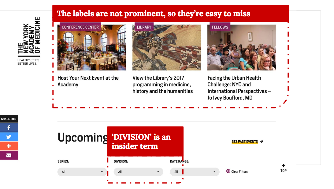
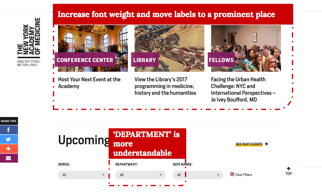
Recommendation: reconsider labels on the “Events” page.
Labels were easy to miss and hard to understand. We recommended making some more prominent, and re-labeling insider terms, such as changing “Division” to “Department.”
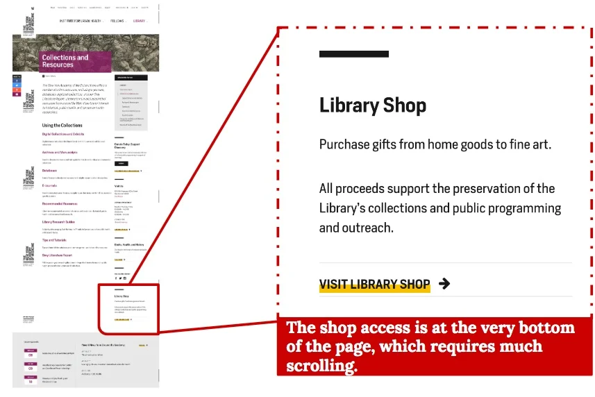
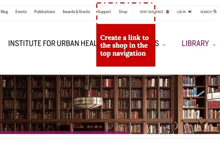
Recommendation: share the Shop.
““First I would go to the homepage and look for the word “shop,” that would be the first thing I did.””
While most of our users expected to find the “Shop” link in the upper right corner of the NYAM home page (which was also the convention we found on multiple comparable sites), the Library linked to the shop section in the bottom right corner of an obscure page.
We recommended placing the link to the library shop in the top navigation. This however was outside of our client’s scope of influence, even though their unique gift products would presumably also support the branding of the greater NYAM organization as well.
Takeaways
We learned that both first-time users and experienced users faced challenges while using the Library website, and usability testing showed us clearly the different issues that needed to be addressed. Even though the site design and branding were fixed, we were able to recommend a few fundamental changes that could still improve the user experience. The information architecture, made visible in the mega menu, was the primary opportunity to signal users about how to use the site properly.
Conclusion
““We’re also redesigning the homepage! Thanks so much!”
— Allison Piazza”
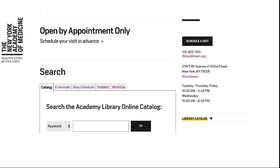
The original Library home page contained very little wayfinding direction, compared with the re-designed page. The new home page now features prominent clickable feature boxes, pointing users to the Shop and including a call-for-action to “Schedule a Visit.” And finally, the “Visit Us” button in the right-hand navigation is less dominated in the design by other content.
Further user testing would prove that these changes are improvements to the experience of the site. Meanwhile it’s satisfying to see that the results of our own research have been implemented.
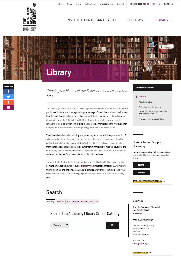
The home page of the NYAM Library, at the time of our research project.
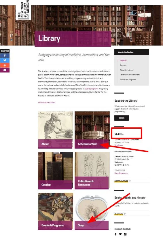
The NEW re-designed home page of the NYAM Library website.